General
THE BUTTER
.page.container.breath.rbreath.lbreath.hbreath.breathout.lpad.rpad.hpad.padtop.spaced.doublespaced.lspace.rspace.spacedout.doublespaced.spacetop.l.r.lauto.rauto.center.center-content.dinline.dblock.hidden.flex-nowrap.rel.txt-c.txt-l.txt-r.text-nowrap.wrap-break.wrap-none.bthin.bthick.bthin-dark.bthick-dark.clear
The idea is very simple, you only need one class to take care of responsive width, which is the page class. Following is a simple example of the most usably layout.
<div class="page">
  <div class="container">
    <h2>ShutLayout</h2>
    <p><strong>.page</strong> controls responsive behavior, <strong>.container</strong> adds paddings</p>
  </div>
</div>
<div style="background-color:#f3f3f3">
  <div class="page">
    <div class="container">
      <h3>Page content</h3>
      <p>This is content in another <strong>page</strong> class element, surrounded by a different background.</p>
    </div>
  </div>
</div>
<header>
  <div class="page">
    <div class="container">
        Header, use container to add padding
    </div>
  </div>
</header>
<footer>
  <div class="page">
    <ul>
      <li>copyrights</li>
      <li><a>Footer link</a></li>
    </ul>
  </div>
</footer>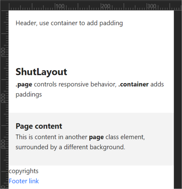
Layout
The mantra of this framework is to reduce developer footprints, and fasten prototyping. You will not find the
generous (unnecessary) margins and paddings you run across in Bootstrap. All of the following use one of four
spacing defitions: @space,
@halfspace, @extraspace, and @doublespace.
Fully logical
All classes that involve right or left definition, are logical classes and use logical CSS logical properties. You code for LTR, and it will be reversed when the RTL stylesheet is appended to body.
.breath
@halfspace padded from top and bottom).rbreath
.lbreath
.hbreath
.breathout
.rpad
@space) logical.lpad
.hpad
.padtop
.spaced
@space).doublespaced
@doublespace).lspace
.rspace
.spacedout
.doublespacedout
.spacetop
.l
.r
.lauto
.rauto
.center
.center-content
.dinline
.dblock
.dflex
.hidden
.flex-nowrap
.rel
.txt-c
.txt-l
.txt-r
.text-nowrap
.wrap-break
.wrap-none
.bthin
.bthick
.bthin-dark
.bthick-dark
.clear
.dscroll
Examples
Border bottom, used heavily in prototyping.
<div class="bthin spaced">.bthin.spaced</div>
<div class="bthick spaced">.bthick.spaced</div>
<div class="bthin-dark spaced">.bthin-dark.spaced</div>
<div class="bthick-dark spaced">.bthick-dark.spaced</div>Content, of certain width and minimum height, centered.
<div class="center-content center h-5 c-8">
  Content center
</div>